We were honored to collaborate with NEXT Atlanta, an organization dedicated to showcasing talented artists and using art to inspire social change. The goal was to create a brand identity that reflected Next Atlanta’s values of creativity, inclusivity, and social impact. It turned out to be more fun than expected and the live shows were […]
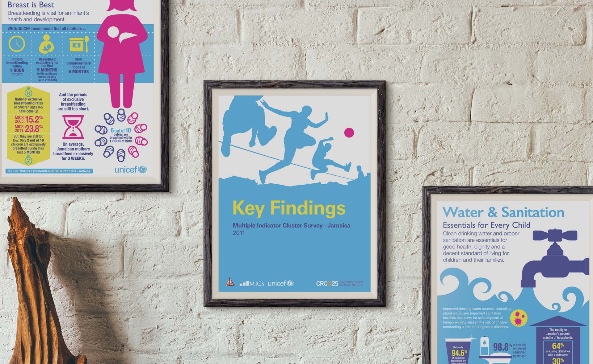
UNICEF sought a way to make the key results of their Multiple Indicator Cluster Study more accessible and engaging. The solution was to transform the report’s key findings into clear and concise infographics. These visuals proved versatile, serving as posters, website banners, and social media content. By presenting the data in a visually appealing format, […]
When this entrep came to us with her vision for healthy, handcrafted dog treats, we knew it was a perfect match. Her passion for quality ingredients and commitment to happy pups resonated with the team. We were also smitten with Sashi, whose wagging tail sealed the deal. Together, we crafted packaging that reflects the love […]
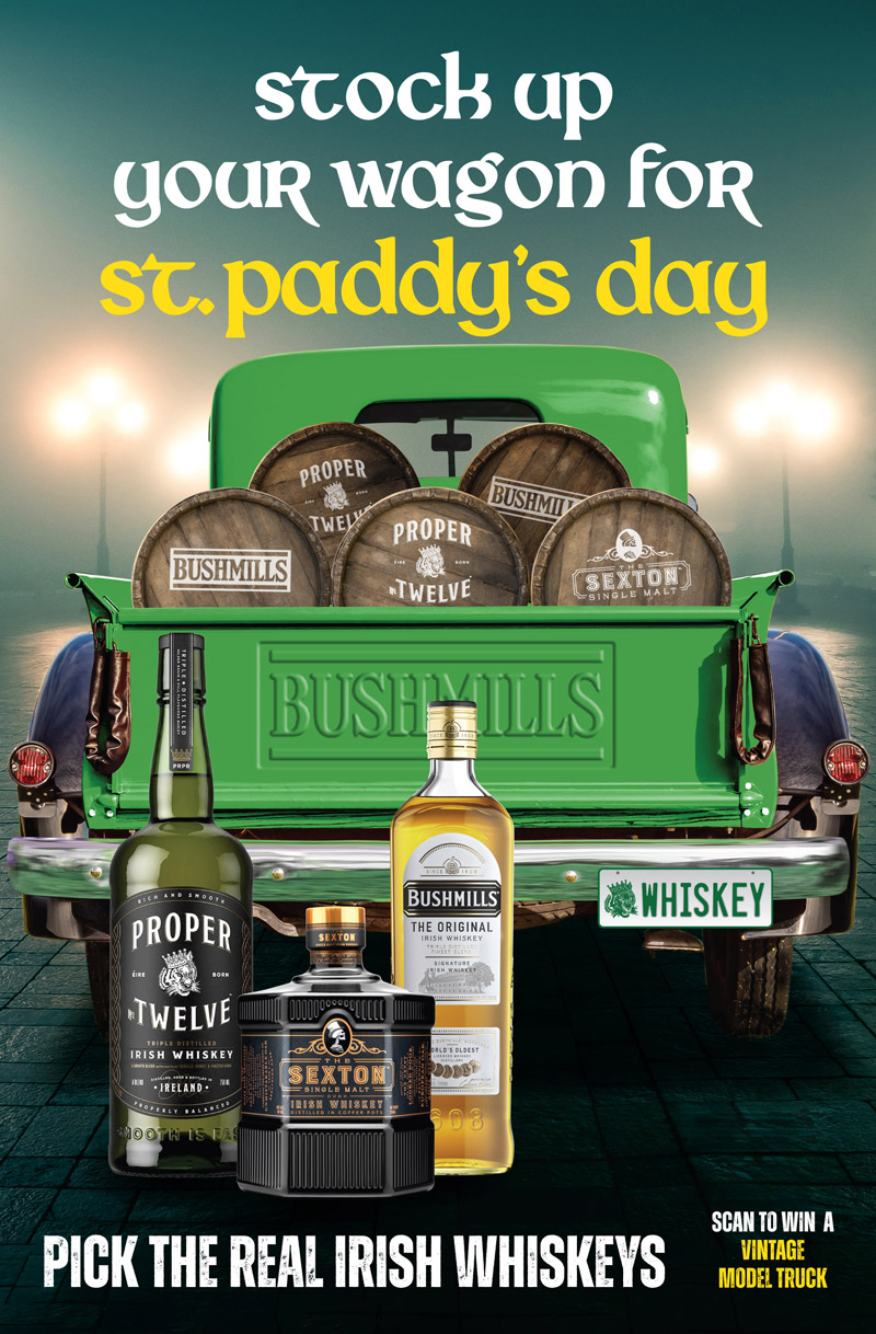
This project involved crafting eye-catching and festive design concepts for our client’s portfolio of alcohol brands. The focus was on capturing the spirit of the holidays while highlighting the unique flavors and appeal of each group’s offerings. The concepts ranged from elegant and sophisticated to playful and vibrant, ensuring a diverse range of options.
Partnering with the Caribbean Policy Research Institute, we reimagined their research publications. By incorporating striking imagery, vibrant infographics, and engaging data visualizations, we breathed new life into their work, making complex information accessible and captivating.
When Nyam & Trod’s founder came to us with her idea for a magazine for “home cooks and nomads”, we thought it sounded more like the beginnings of a food media house. She loved the idea and we started a series of meetings and brainstorm sessions with her that led to a complete brand identity […]
How do you revive a 20-year old logo, with a niche following, that seems to have gotten it right the first time? First, we had to step back from our emotional connection to the Spliffie logo and look at it with contemporary eyes. The old logo used a custom hand-written font circling a headshot of […]
When we decided to do our new stationery, we all knew we wanted it to be minimalist. We wanted colours and lines that would be bold, but still unobtrusive so our materials wouldn’t hog the stage, leaving the focus on our work and the work we do for our clients. With that starting point, the […]